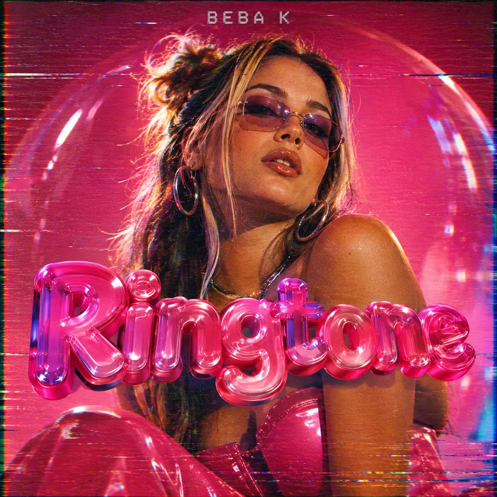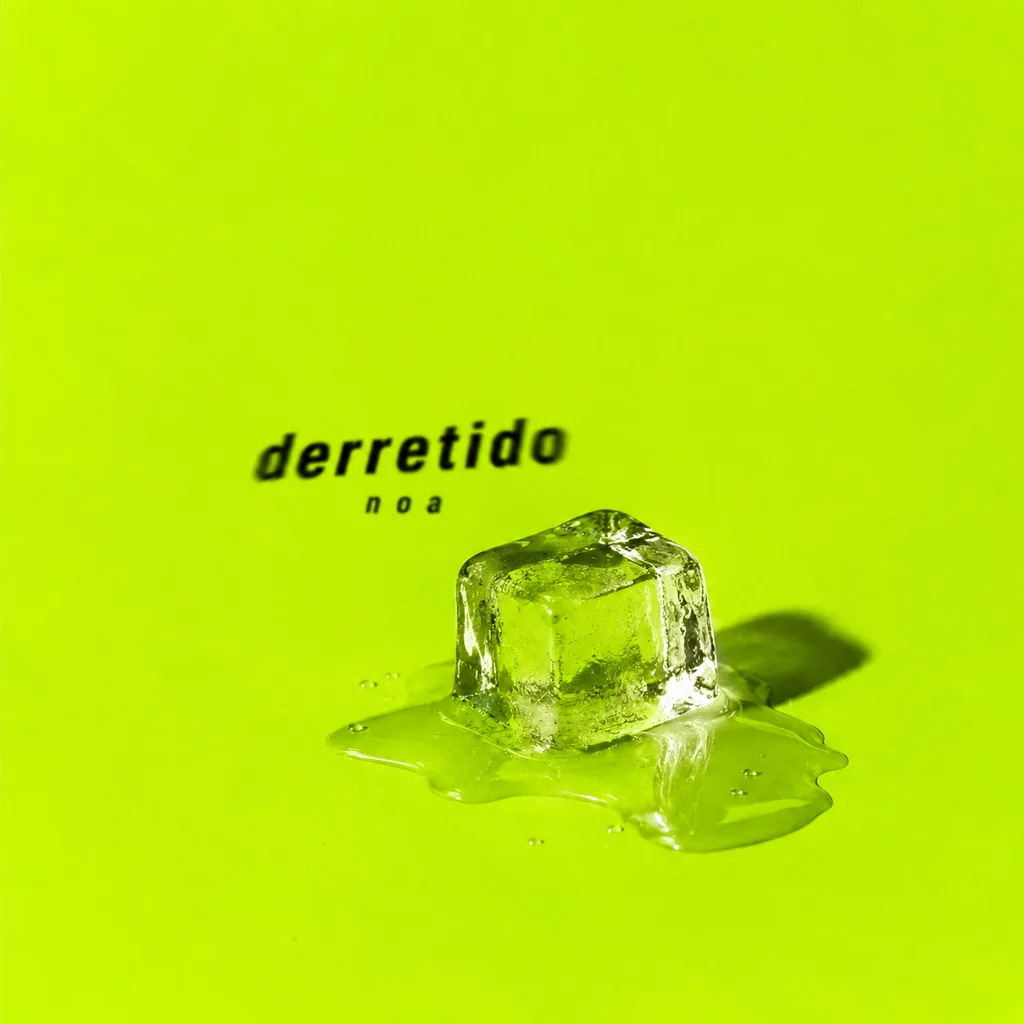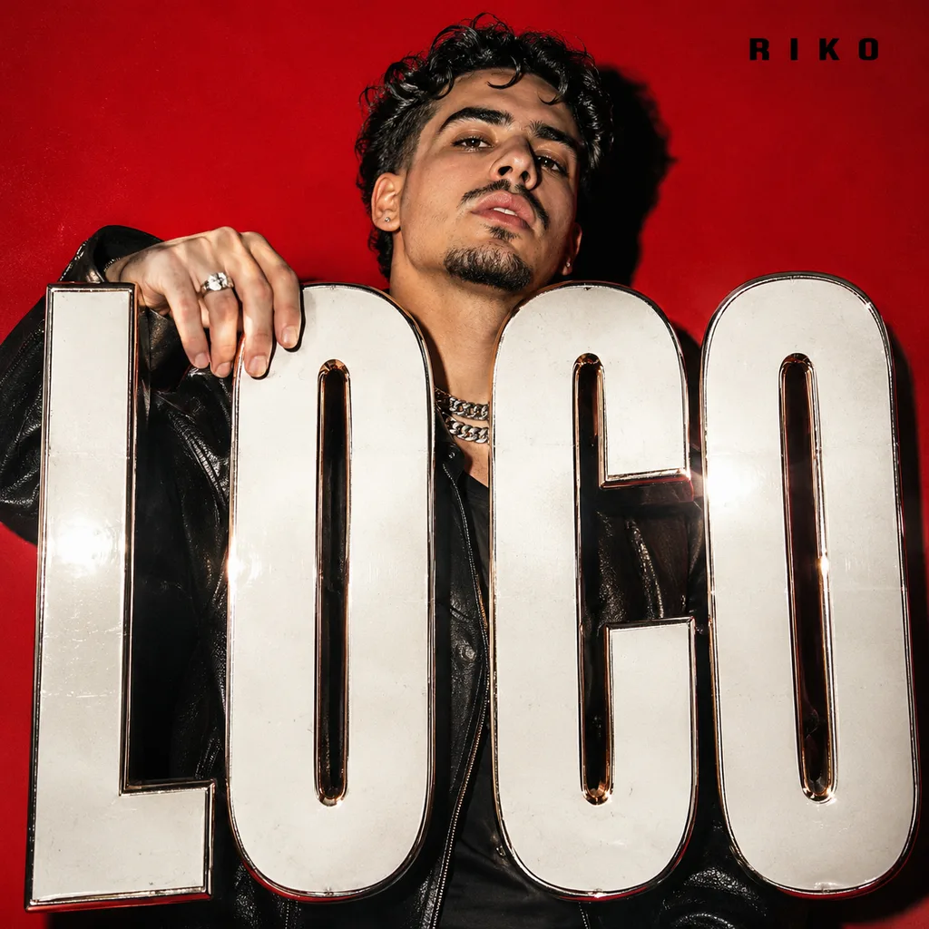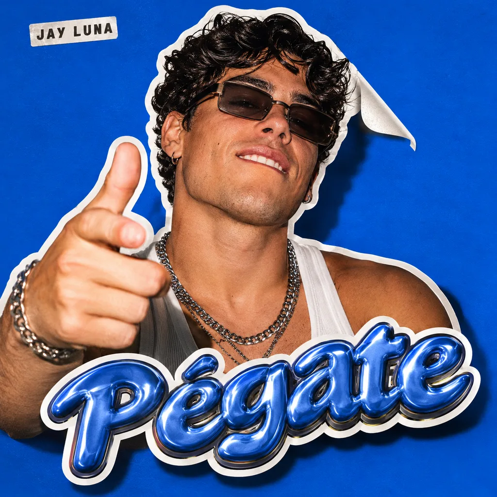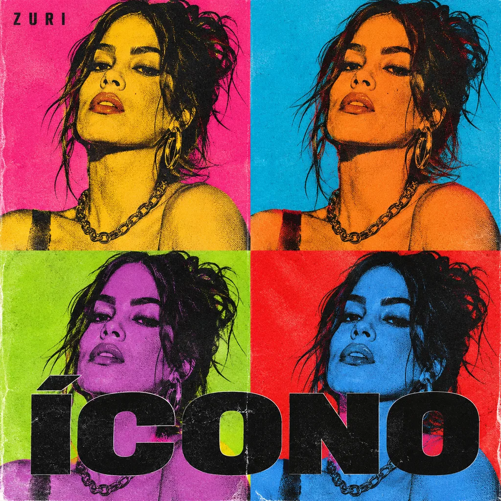
Example: "ÍCONO" by ZURI (made-up artist)
Warhol grid
An icon, repeated in color.
poptrapelectrónica
Why it works
Repeating the same face in different colors is the pop-art formula: it turns a normal photo into an icon. Screen-print with offset inks looks truly printed.
How to adapt it to your song
With your photo it's your face four times. Ask for 3x3 for something more intense.
The prompt
Professional music album cover art, square 1:1 format. The artist's idea decides the scene, pose, props and composition (the style only adds camera, light and color): A 2x2 grid of the same silkscreen-printed portrait of the artist, each panel in a different flat clashing color combination (hot pink with yellow, cyan with orange, lime with purple, red with blue), with slightly offset ink layers and screen-print texture. The title "ÍCONO" in a bold black condensed sans across the bottom panels. "ZURI" small in the top-left panel.. Camera, light and color in this style, keeping the scene above: hyper-realistic high-fashion editorial cover, medium format camera with an 85mm lens at f/1.8, the artist facing camera, real skin texture, large soft key light with a crisp rim light, shallow depth of field with creamy bokeh, deep teal shadows and warm amber highlights, luxury magazine cover energy. The background: pure void black background, minimal negative space. The song title "ÍCONO" appears ONLY where the scene places it, spelled exactly, once; do not add it again anywhere else. Artist name on the cover, spelled exactly, small and shown once: "ZURI". The title appears EXACTLY ONCE, only where the scene above places it and made of the material the scene describes; do NOT add a second title, logo or headline anywhere else (no chrome or metallic logo at the top). The artist name appears once, small, where the scene says. Every letter perfectly spelled and fully visible. No other readable text anywhere. Pop graphic art direction: one clear idea, a short bold color palette, a simple or flat background, readable as a phone thumbnail. People look natural and real, with personality or humor, dressed as described; never a generic glamour or swimsuit pose. Finish the whole image, lettering included, like this: harsh direct on-camera flash photography like a 2000s paparazzi or Juergen Teller editorial: hard specular highlights on skin and jewelry, crisp shadow outline behind the subject, slightly blown highlights, deep black falloff, raw candid energy, visible skin texture and pores, no retouching. Finish it like real printed graphic design, not an AI render: flat clean color areas, crisp shapes, visible print texture where it fits (halftone dots, risograph grain, paper tooth), no glossy 3D sheen, no HDR, no plastic skin, no lens flare.
This is the exact prompt Vanta uses (GPT Image 2). It works in other generators too, but results vary by model.
Make it with your face
In Vanta you upload your photo and the recipe keeps your identity, with cinema-grade lettering and finish. Also from ChatGPT or Claude: ask to "use the recipe Warhol grid" with the Vanta Label connector.